
홍동이의 성장일기
[👩💻TIL 13일차 ] 유데미 스타터스 취업 부트캠프 4기 본문

목차
[185차시]ggplot2 패키지 설치 및 기본 문법
ggplot2
- 데이터 시각화 패키지: 기본 패키지보다 우수한 시각화 기능 제공
- gg (Grammar of graphics)
- 그래프 문법 구조바탕
- 일관된 규칙에 따라 그래프 생성
- 우수한 사용성
- 빠른 시각화를 위한 quick 함수 제공
- 그래프 문법 기반 자세한 조정 가능
- 통계 시각화 기능 제공
#설치
install.packages("ggplot2")
library(ggplot2)
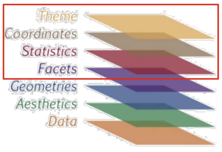
Layer 구조
- Grammar of graphics 저서 기반: 데이터 시각화는 요소들의 층으로 이루어짐

- ggplot2 문법 구조: data layer부터 시작하여 각 층의 요소들을 더해 시각화를 완성하는 방식
- Data(데이터) layer: 시각화를 하려는 데이터를 입력하는 층
- data frame 형식 사용 - Aesthetics(미학적) layer: 데이터를 매핑하고자 하는 스케일 설정
: x/y축 컬럼 지정, 색깔, 점/선 모양, 축에 대한 범위 등 - Geometires(기하학) layer: 데이터 사용하는 시각화 요소 정의
: 점/선, 히스토그램, 원 차트, 박스그림 등 - Facets(양상) layer: 특정 기준에 따라 그래프 나눔, 화면 분할
- Statistics(통계) layer: 그려진 그래프에 대한 통계적인 시각화 처리
- Coordinates(좌표) layer: 좌표계를 조작
- Themes(테마) layer: 데이터가 아닌 추가 꾸미기 요소 (제목 등)
- Data(데이터) layer: 시각화를 하려는 데이터를 입력하는 층
qplot(): Quick plot
- 빠르게 데이터 시각화 할 때 사용
- 데이터 외의 값을 지정하지 않아도 기본값 사용가능
- layer별 문법 요소 지정 기능은 존재
- 기본 시각화 함수(plot)와 유사한 사용법
- 문법: qplot(data=‘사용할 데이터 변수명’, x=‘data에서 x축에 사용할 변수’, y =‘data에서 y축에 사용할 변수’)
- 그래픽 문법 요소 층의 2개 층 표현
- 1층: data layer (데이터 지정)
- 2층: aesthetics layer (x, y축 지정)
- 그래픽 문법 요소 층의 2개 층 표현
ggplot(): Grammar of graphics plot
- 그래픽 문법 요소 층 전부 또는 일부를 직접 쌓아 데이터 시각화
- '+' 연산자를 사용하여 문법 요소 추가
- 원하는 모든 형태의 복잡한 시각화 자료 표현 가능
- 문법: ggplot(data=‘데이터 변수 명’, mapping = aes(x=‘data에서 x축에 사용할 변수’, y =‘data에서 y축에 사용할 변수’, ...))
- ggplot은 문법 요소 층을 쌓을 시작 지점이 되는 함수
[186차시]ggplot2를 사용한 데이터 시각화
Layer 구조
필수 입력 layer
- 데이터가 시각화 되기 위해서 반드시 정의되어야 하는 layer
- 1층: data
- 2층: x,y축 (그 외는 옵션)
- 3층: point, line, boxplot 등 (최소 1개 이상)

산점도 그래프
geom_point() 함수
→ '+' 연산자 사용하여 추가 layer 추가
ggplot(dataFrame, aes(x=x축, y=y축)) +
geom_point()
- 주요 매개변수
- shape: 점 모양
- color: 테두리 색
- fill: 채우기 색
- size: 점 크기
- stroke: 테두리 두께
Aesthetics layer
aes(x,y, col, fill))- col: 선 색
→ 점(테두리), 선 등에 사용 - fill: 색 채우기
→ 막대 그래프, 히스토그램 등에 사용
선 그래프
geom_line() 함수
ggplot(dataFrame, aes(x=x축, y=y축)) +
geom_line()
- 주요 매개변수
- color: 선 색
- size: 선 크기
- arrow: 선 끝에 화살표 생성
→ arrow() 함수 매개변수 값으로 사용
geom_bar() 함수
ggplot(dataFrame, aes(x=x축)) +
geom_bar()
- geom_point 주요 매개변수 참고
geom_histogram() 함수
ggplot(dataFrame, aes(x=x축)) +
geom_histogram()
- 주요 매개변수
- binWidth: 히스토그램 데이터를 나누는 구간의 길이
※ 주의: 히스토그램 바 개수가 아님 - geom_bar 주요 매개변수 참고
- binWidth: 히스토그램 데이터를 나누는 구간의 길이
geom_histogram() 함수
- y축 값(수치형)만 입력 가능
- x축값(범주형)과 함께 입력 시, 범주별 데이터의 상자그림 출력가능
ggplot(dataFrame, aes(x=x축, y=y축)) +
geom_boxplot()
- geom_boxplot 주요 매개변수 참고
[187차시]ggplot2를 사용한 그래프 꾸미기
Layer 구조
옵션 layer: 데이터 시각화 완성도를 높여주는 layer
- 4층(Facets): 범주값 별 서브그래프 분석
- 5층(Statistics): 통계관련값 시각화
- 6층(Coordinates): 좌표계 변환
- 7층(Theme): 배경, 제목 등 추가/변경
Facets layer
: 범주형 컬럼의 변수별 서브 그래프를 각기 다른 패널에 그려주는 층
→ 일종의 화면 분할 기능
- 문법
- '~' 뒤에 서브 그래프를 그릴 범주형 컬럼명 기입
ggplot(…) +
geom_xxxx(..) +
facet_xxxx(~’범주형 변수’)
- 주요 함수
- facet_wrap()
: 1가지 범주형 컬럼에 대한 서브 그래프 출력하는 함수 - facet_grid()
: 2가지 범주형 컬럼에 대한 서브 그래프 출력하는 함수
주요 매개변수
- labeller: 'label_both' 사용시 컬럼명과 범주값 함께 출력
- nrow, ncol: 'nrow x ncol' 형태로 서브 그래프 배치
- facet_wrap()
# facet_wrap
ggplot(…) +
geom_xxxx(..) +
facet_wrap(~’범주형 컬럼 변수’, labeller=label_value, nrow=NULL, ncol=NULL)

# facet_grid
ggplot(…) +
geom_xxxx(..) +
facet_wrap(’범주형 컬럼 변수1’~’범주형 컬럼 변수2’, labeller=label_value)
Statistics layer
: 데이터에 대한 통계값을 시각화 해주는 층
- 주요 함수
- stat_smooth()
: 데이터에 회귀선을 그리는 함수
주요 매개변수
- level: 신뢰구간 (0.0 ~ 1.0) - stat_summary()
: x값에 대한 y값의 간단한 통계값을 그래프에 그려주는 함수
주요 매개변수
- fun.y: 구하고 싶은 통계함수 (ex. mean, min, max, median 등)
- color: geom 색
- size: geom 크기
- geom: 통계치를 나타낼 시각화 형
- stat_smooth()
# stat_smooth
ggplot(…) +
geom_xxxx(..) +
stat_smooth(level=0.95)

# stat_summary
ggplot(…) +
geom_xxxx(..) +
stat_summary(fun.y = mean, color, size, geom = ‘point’)
Coordinate layer
: x축 또는 y축 정보를 변형하는 시각화 층
- 주요 함수
- coord_cartesian(xlim, ylim)
: x축, y축 범위 지정 - coord_flip()
: x축, y축 반전 - coord_polar()
: (x, y) 좌표계를 극좌표계로 변환
- coord_cartesian(xlim, ylim)
Theme layer
: 데이터와 무관한 시각화 요소를 꾸밀 수 있는 층
- 주요 함수
- ggtitle(" ")
: 제목 작성 - theme(···)
: 제목, 축, 범례, 판넬, 배경, facet 모양 등의 속성 변경 - theme_gray()
: 배경을 회색으로 지정 - theme_bw()
: 배경을 하얀색으로 지정
- ggtitle(" ")
[188차시]ggplot2 기반 시각화 실습
library(readxl)

data <- read_excel('day.xlsx', col_names = TRUE, range=cell_cols(4:12) )
data <- data[,c(-3, -4, -6, -8)] #필요없는 컬럼 제거
print(data)


library(dplyr)

# 열 이름 특수문제 제거
result <- data %>% names() %>% strsplit(split="[[:punct:]]") #특수문자를 구분자로 사용. '(' 포함
result

new_name <- c()
for(t in result){ #list의 특정 값을 가져올 때는 index문을 사용하여 index 직접 참조
  print(t)
  print(paste("first value:", t[1]))
  new_name <- c(new_name, t[1])
}
print(new_name)

#컬럼 명 변경
names(data) <- new_name
head(data)

#결측치 값 변경
data$폭염영향예보[is.na(data$폭염영향예보)] <- "보통" # '폭염영향예보' 컬럼 NA값 "보통"으로 변경
str(data)
data <- na.omit(data) # NA가 존재하는 행 제거
str(data) # 데이터 전처리 완료 결과 확인

#Q4 시각화1. 최고기온=x, 최고체감온도=y, col=자외선지수
ggplot(data, mapping = aes(x=최고기온, y=최고체감온도, col=자외선지수)) +
  geom_point()

#Q5-1. + facet1
ggplot(data, mapping = aes(x=최고기온, y=최고체감온도, col=자외선지수)) +
  geom_point() +
  facet_wrap(~자외선지수)

#Q5-2. + facet2
ggplot(data, mapping = aes(x=평균상대습도, y=최고체감온도, col=자외선지수)) +
  geom_point() +
  facet_grid(폭염영향예보~자외선지수, labeller=label_both)

#Q6. + statistics
ggplot(data, mapping = aes(x=최고기온, y=최고체감온도, col=자외선지수)) +
  geom_point() +
  facet_wrap(~자외선지수) +
  stat_smooth(level=0.99)

#Q7. + coordinates
ggplot(data, mapping = aes(x=최고기온, y=최고체감온도, col=자외선지수)) +
  geom_point() +
  facet_wrap(~자외선지수) +
  stat_smooth(level=0.99) +
  coord_cartesian(ylim=c(20,33))

#Q8. + theme
ggplot(data, mapping = aes(x=최고기온, y=최고체감온도, col=자외선지수)) +
  geom_point() +
  facet_wrap(~자외선지수) +
  stat_smooth(level=0.99) +
  coord_cartesian(ylim=c(20,33)) +
  ggtitle("2021년 9월 대한민국 최고기온 대비 최고체감온도") +
  theme_bw()


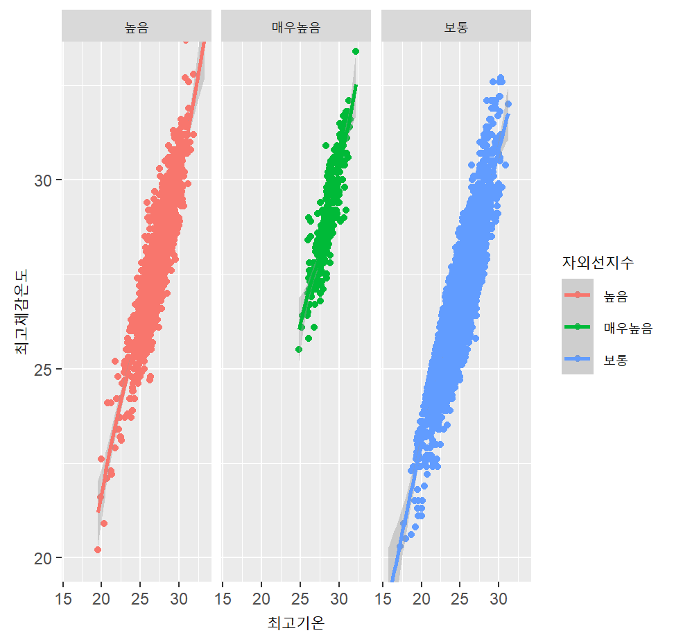

분석을 통해 기온이 높을수록 자외선지수가 높음을 확인할 수 있었고, 이를 보기 좋게 시각화하는 과정을 거쳤다.
[189차시]영화평 텍스트
library(KoNLP)
library(dplyr)
library(stringr)
useNIADic() #NIA 사전

#데이터 로딩
## readLines 함수 사용
txt <- readLines('ratings.txt', encoding = 'UTF-8') #한국어 정상적으로 로딩하기 위해 readLines사용
#영화 평 으로만 구성된 벡터 생성
## 반복문 사용하여 readLines으로 로딩한 데이터 직접 참조해서 벡터 생성
result <- strsplit(txt, split='\t')
data <- vector("character", length(result))
i <- 1
for(item in result) {
data[i] <- item[2]
i<- i+1
}

#영화 평 내 특수문자 제거
## str_replace_all(데이터, '[[:punct:]]', " ") 함수 사용
data <- str_replace_all(data, '[[:punct:]]', " ") #44행 확인하면 ! 사라짐
#선택 사항. 아래 extractNoun함수는 시간이 많이걸림. 빠르게 결과 보고싶다면 데이터 크기 축소
data <- data[1:10000]
#명사 추출
## extractNoun 함수 사용
## extractNoun(“나는 집에 가서 밥을 먹는다.”) << 예시코드 실행 하여 함수 결과물 대략적 확인 후 진행
extractNoun("나는 집에 가서 밥을 먹는다.") #명사 추출하기 예시
nouns <- extractNoun(data) #추가 package 설치할 수 있음

#명사 별 등장 횟수를 data frame 형식으로 저장
## list를 vector로 변환하는 함수인 ‘unlist’ 함수 참고
wordcount <- table(unlist(nouns))
## data frame 형식 1열: 명사, 2열: 등장 횟수
df_word <- as.data.frame(wordcount, stringsAsfactors=F)
str(df_word)
df_word <- rename(df_word, word = Var1, freq = Freq)
#factor에서 character로 자료형 변환
class(df_word$word)
df_word$word <- as.character(df_word$word)
#단어수 2글자 이상인 행만 남김
df_word <- filter(df_word, nchar(word) > 2)
#결과 잘나왔는지 테스트 (등장 횟수 Top 40 추출)
top_40 <- df_word %>% arrange(desc(freq)) %>% head(40)

#패키지 설치
install.packages("wordcloud")
# 패키지 로드
library(wordcloud)
library(RColorBrewer)
pal <- brewer.pal(8, "Dark2") # Dark2 색상 목록에서 8개 색상 추출
pal
set.seed(1)
#wordcloud 출력
wordcloud(words = df_word$word, #단어
freq = round(sqrt(df_word$freq)), #빈도 – sqrt 함수 사용하여 차이 줄임
min.freq = 5, #최소 단어 빈도
max.words = 200, #표현 단어 수
random.order = F, #고빈도 단어 중앙 배치
rot.per = .1, #회전 단어 비율
scale = c(4, 0.5), #단어 크기 범위
colors = pal) #색상 목록
[190차시]국정원 트윗, 발라드 가사
library(KoNLP)
library(dplyr)
library(stringr)
library(ggplot2)
useNIADic() #NIA 사전

twitter <- read.csv("twitter.csv",
header = T,
stringsAsFactors = F,
fileEncoding = "UTF-8")
str(twitter)

#특수문자제거
twitter$내용 <- str_replace_all(twitter$내용, '[[:punct:]]', " ")
head(twitter$내용)
#트윗에서 명사 추출
nouns <- extractNoun(twitter$내용)
wordcount <- table(unlist(nouns))
#데이터 프레임으로 변환
df_word <- as.data.frame(wordcount, stringsAsFactors = F)
df_word <- rename(df_word,
word = Var1,
freq = Freq)
#1글자 단어 제거
df_word <- filter(df_word, nchar(word) >= 2)
#빈도수 단위 top 20선정
top20 <- df_word %>% arrange(desc(freq)) %>%head(20)

#tos20 벡터 빈도별로 정렬한 텍스트 벡터(order) 생성
order <- arrange(top20, desc(freq))$word
ggplot(top20, aes(x = word, y = freq)) +
geom_col() +
scale_x_discrete(limit = order) +
ggtitle("국정원 트윗 고빈도 노출단어 TOP20") +
geom_text(aes(label = freq), vjust= -0.8)
#로딩
txt <- readLines('balad.txt', encoding = 'UTF-8') #한국어 정상적으로 로딩하기 위해 readLines사용
#데이터 전처리
data <- str_replace_all(txt, '[[:punct:]]', " ")
data <- data[1:10000]
nouns <- extractNoun(data) #추가 package 설치할 수 있음
wordcount <- table(unlist(nouns))
df_word <- as.data.frame(wordcount, stringsAsfactors=F)
str(df_word)
df_word <- rename(df_word, word = Var1, freq = Freq)
class(df_word$word)
df_word$word <- as.character(df_word$word)
class(df_word$word)
df_word <- filter(df_word, nchar(word) >= 2) #2글자 이상인 단어만 남김

pal <- brewer.pal(8, "Dark2")
set.seed(20)
#CloudForm 시각화
wordcloud(words = df_word$word, #단어
freq = round(sqrt(df_word$freq)), #빈도 차이 줄임
min.freq = 5, #최소 단어 빈도
max.words = 200, #표현 단어 수
random.order = F, #고빈도 단어 중앙 배치
rot.per = .1, #회전 단어 비율
scale = c(3, 0.5), #단어 크기 범위
colors = pal) #색상 목록
top20 <- df_word %>% arrange(desc(freq)) %>%head(20)
order <- arrange(top20, desc(freq))$word
#막대그래프 시각화
ggplot(top20, aes(x = word, y = freq)) +
geom_col() +
scale_x_discrete(limit = order) +
geom_text(aes(label = freq), vjust= -0.8)
[191차시]미국 주별 강렬 범죄율
#패키지 설치
install.packages("ggiraphExtra") # 단계 구분도 함수 제공
install.packages('maps') # ggiraphExtra를 실행하기 위한 패키지
install.packages("gridExtra") # 화면분할을 위한 패키지
#패키지 로딩
library(ggiraphExtra)
library(tibble)
library(ggplot2)
library(gridExtra)

head(USArrests)

#데이터셋 로딩
crime <- rownames_to_column(USArrests, var = 'state')
crime$state <- tolower(crime$state)
print(crime$state)

states_map <- map_data # 위성 좌표값
str(states_map)
View(states_map %>% filter(states_map$region == "alabama"))

ggChoropleth(data = crime,
             aes(fill = Murder,
                 map_id = state),
             map = states_map,
             interactive = T)
#나타내고 싶은 plot을 각각의 변수에 저장
p1 <- ggplot(data= crime, aes(x=UrbanPop, y=Murder))+
  geom_point() + # 점
  stat_smooth(level = 0.9) # 회귀곡선
p2 <- ggplot(data= crime, aes(x=UrbanPop, y=Assault))+
  geom_point() +
  stat_smooth(level = 0.9)
p3 <- ggplot(data= crime, aes(x=UrbanPop, y=Rape))+
  geom_point() +
  stat_smooth(level = 0.9)

grid.arrange(p1, p2, p3)
[192차시]시계열 데이터 예측
시계열 데이터란?
시간 값에 따라 변하는 데이터
#패키지 설치
install.packages("forecast")
install.packages("quantmod")
#패키지 로딩
library(forecast)
library(quantmod)
library(ggiraphExtra)
library(ggplot2)
library(gridExtra)

#sin 함수 파형 예측
x = seq(0, 5, 0.01)
y = ts(sin(2* pi * x) + x, frequency= 100) # ts: time-series 타입
plot(x,y, type='l')
plot(forecast(y, h=200)) #h: 예측할 데이터 개수

class(AirPassengers) # ts

plot(x= c(1:144), y=AirPassengers, type="l")
plot(forecast(AirPassengers), h=200)


## 삼성전자 주식코드
data_pred = getSymbols('005930.KS',
                       from = '2021-01-01', to = '2021-09-01',
                       auto.assign = FALSE)
data_real = getSymbols('005930.KS',
                       from = '2021-01-01', to = '2021-10-30',
                       auto.assign = FALSE)

str(data_pred)
head(data_pred)


# 데이터 컬럼명 변경경
names(data_pred) <- c("open", "high", "low", "close", "volume", "adjusted")
names(data_real) <- c("open", "high", "low", "close", "volume", "adjusted")
head(data_pred)

# 행 이름 열 추가
data_pred <- rownames_to_column(as.data.frame(data_pred), var = 'date')
data_real <- rownames_to_column(as.data.frame(data_real), var = 'date')
head(data_pred)

# date컬럼 Date형식으로 형변환환
data_pred$date <- as.Date(data_pred$date)
data_real$date <- as.Date(data_real$date)


pred_length <- length(data_real$close)-length(data_pred$close)

test <- forecast(data_pred$close, h=pred_length)
head(test)
class(test)
test <- as.data.frame(test)
length(test$`Point Forecast`)


data_real[,"pred_close"] <- c(data_pred$close, test$`Point Forecast`)
str(data_real)

datebreaks <- seq(as.Date("2021-01-01"), as.Date("2021-10-01"), by="1 month")
ggplot(data=data_real, aes(x=date)) +
  geom_line(aes(y=pred_close, col='red')) + # 예측선 먼져 빨간색으로 그린다
  geom_line(aes(y=close)) +
  scale_x_date(breaks=datebreaks) + #Theme layer. x축을 date값으로 나타냄
  theme(axis.text.x = element_text(angle=30, hjust=1)) # x축 값 텍스트를 30도 회전
주가 예측은 패턴이 불확실하기 때문에 이러한 간단한 코드로는 예측이 불가능하다😯
[193차시]통계 분석 기법을 이용한 가설 검정
가설검정이란?
: 모집단에 대한 가설을 모집단으로부터 추출한 표본을 사용하여 검토하는 추론방법
- 모집단: 정보를 얻고자 하는 관심 대상의 전체집합
- 표본: 모집단으로부터 샘플링하여 얻어지는 결과 / 모집단의 부분집합 (= 데이터셋)
- 귀무가설
- 차이가 없는 경우의 가설
- 처음부터 버릴 것을 예상하는 가설
- 대립가설
- 차이가 있는 경우의 가설
- 검증하고 싶은 가설
- 원리: 통계량을 계산한 후, 유의 수준을 넘는지 비교
- 통계량
- 판단을 위해서 계산하여 얻는 1종 오류가 발생할 확률의 허용한계 특정 값
- z값을 사용하면 z-test, t값을 사용하면 t-test로 부름
- 유의수준: 1종 오류가 발생할 확률의 허용한계 (보통 5%)

Z검정
- 가정: 모집단은 정규분포를 따른다고 가정

- Z 검정
- 정규분포에서는 유의 수준에 따른 비교 값이 고정
- 모집단의 평균과 표준편차를 알 때 사용
- 유의 수준 값보다 z값이 크다면 귀무가설 기각
- 결과를 말할 때는 언제나 '유의수준 ~%에서 귀무가설을 기각/유지한다'라고 붙여말함
- p-value가 유의수준보다 크다면 귀무가설 유지, p-value가 유의수준보다 작다면 귀무가설 기각
z-test 함수
install.packages("BSDA")
library("BSDA")
z.test(x=data, alternative = “two.sided", mu=175, sigma.x=6, conf.level = 0.95) # conf.level = 1 – 유의 수준
[194차시]t검정 및 통계 분석 유의사항
t검정
- 가정: 모집단은 정규분포를 따른다고 가정

- t검정
- 모집단의 표준편차를 모를 때, 표본의 표준편차를 사용해 검정하는 방법
- 유의 수준 값보다 t값이 t분포표 값보다 크다면 귀무가설 기각
- p-value가 유의수준보다 크다면 귀무가설 유지, p-value가 유의수준보다 작다면 귀무가설 기각
- 양측검정이기에 a/2값 사용
t.test 함수
install.packages("BSDA")
library("BSDA")
t.test(x=data, alternative = "two.sided", mu=175, sigma.x=6, conf.level = 0.95)
- 양측/단측 검정 유무에 상관없이 conf.level 고정
- 1 - conf.level보다 p-value가 낮다면 유의수준 conf.level에서 귀무가설 기각
양측 검정
- 대립가설이 "같지 않다"라는 조건으로 주어지는 경우 사용

- '같지 않을' 조건은 특정값보다 많이 크거나, 많이 작으면 됨
- 양쪽 바깥 영역의 밀도가 유의 수준과 같아져야 함
- 통계량을 유의수준/2 값과 비교해야함

단측 검정
- 대립가설이 "크다", "작다"라는 조건으로 주어지는 경우 사용

- '작을' 조건은 특정값보다 많이 작은 경우 한방향뿐
- '클' 조건도 동일
- 한쪽 바깥 영역의 밀도가 유의 수준과 같아져야함
- 통계량을 유의수준과 비교해야함

- z/t.test 함수의 alternative 매개변수 (매개변수 별 의미 확인)
- 유의수준을 별도로 조정할 필요는 없음 (직접계산시 조정 필요)
library("BSDA")

data <- read_excel('man_height.xlsx')
z.test(x=data, alternative = "greater", mu=175, sigma.x=6, conf.level = 0.95)
z.test(x=data, alternative = "less", mu=175, sigma.x=6, conf.level = 0.95)
t.test(x=data, alternative = "two.sided", mu=175, conf.level = 0.95)
z/t검정의 전제
- 두 집단 간의 검정 방법
- 3개 이상 집단간의 검정은 다른 방법론 필요 (아노바였던것같다..)
- 아래 3가지 조건을 만족해야 z/t검정 사용가능
- 독립성: 한 집단에서 사용한 표본을 다른 집단에서 사용하지 않음
- 정규성
- 표본 데이터가 정규분포를 따름
- Shapiro-wilk 검정 - 등분산성 독립성
- 집단 내 특정 샘플이 선택될 확률은 모두 같음
- Levene 검정
- 실데이터셋 검정시, 위 3가지 조건 선제적으로 분석 필요
[195차시]상관분석
상관분석이란?
- 두 변수 간에 어떤 관계를 가지는지 분석하는 기법
- 상관계수(Correlation coefficient) 사용
- 상관관계의 강도를 나타내는 척도
- 0~1 사이 값으로 정의
- 상관계수 종류
- 피어슨(Pearson) 상관계수
- 켄달(Kendall) 상관계수
- 스피어만(Spearman) 상관계수

상관계수 설명
피어슨 상관계수
- 연속형 변수의 선형적인 상관관계 측정 구성
: 가장 기본적으로 사용되는 상관계수
켄달, 스피어만 상관계수
- 순서가 있는 변수의 상관관계 측정
- 순서가 있는 범주형/수치형 데이터 분석가능
- 한 축의 순서가 올라갈 때, 다른 축의 순서가 올라가는지에 대한 검정
- 단조 증가, 단조 감소하는 데이터에 큰 상관관계 부여
- 비선형적인 상관관계 분석 가능

[켄달 상관계수 예시]
cor(data[,1:4], method="kendall")

#psych 패키지 사용 – 통계 관련 유용한 함수 다수 제공
install.packages("psych")
library(psych)
#컬럼 별 상관계수 및 컬럼 별 상관관계 가설검정 수치 함께 출력. cor 함수와 cor.test 함수와 동일
corr.test(data[,1:4],
          use = 'complete',
          method = 'kendall',
          adjust ='none')
[스피어만 상관계수 예시]
cor(data[,1:4], method="spearman")

#psych 패키지 사용 – 통계 관련 유용한 함수 다수 제공
install.packages("psych")
library(psych)
#컬럼 별 상관계수 및 컬럼 별 상관관계 가설검정 수치 함께 출력. cor 함수와 cor.test 함수와 동일
corr.test(data[,1:4],
          use = 'complete',
          method = 'spearman',
          adjust ='none')
상관계수 시각화
install.packages("corrplot")
library(corrplot)

col <- colorRampPalette(c("#BB4444", "#EE9988", "#FFFFFF", "#77AADD", "#4477AA"))
M = cor(iris[,1:4])
corrplot(M,
         method = "color",
         col = col(150),
         type = "upper",
         order = "hclust",
         number.cex = .7,
         addCoef.col = "black",
         tl.col = "black",
         tl.srt = 90,
         sig.level = 0.01,
         insig = "blank",
         diag = FALSE)
[196차시]실습! 와인 성분과 품질 간 관계 구하기
myload_data <- function(path){ # 로딩 과정 함수화
  data <- read.table(path, header = T, sep = ';')

  for (col in names (data)){ # 모든 값들이 문자열로 덮여 있으므로 숫자화
    data[,col] <- as.numeric(data[,col])
  }
  return(data)
}

red_wine <- myload_data('winequality-red.csv')
white_wine <- myload_data('winequality-white.csv')


library(corrplot)
mydraw_correlation <- function(data, cor_method="pearson"){
  M <- cor(data, method=cor_method)
  names(M) <- names(data) #데이터 상관관계값 추출하면 컬럼 이름명 사라짐. 재할당
  col <- colorRampPalette(c("#BB4444", "#EE9988", "#FFFFFF", "#77AADD", "#4477AA"))
  corrplot(M,
           method = "color",
           col = col(150),
           type = "upper",
           order = "hclust",
           number.cex = .7,
           addCoef.col = "black",
           tl.col = "black",
           tl.srt = 90,
           sig.level = 0.01,
           insig = "blank",
           diag = FALSE)
}
mydraw_correlation(white_wine) #피어슨 상관관계 비교
mydraw_correlation(red_wine)
mydraw_correlation(white_wine, "spearman") #피어스만 상관관계 비교
mydraw_correlation(red_wine, "spearman")
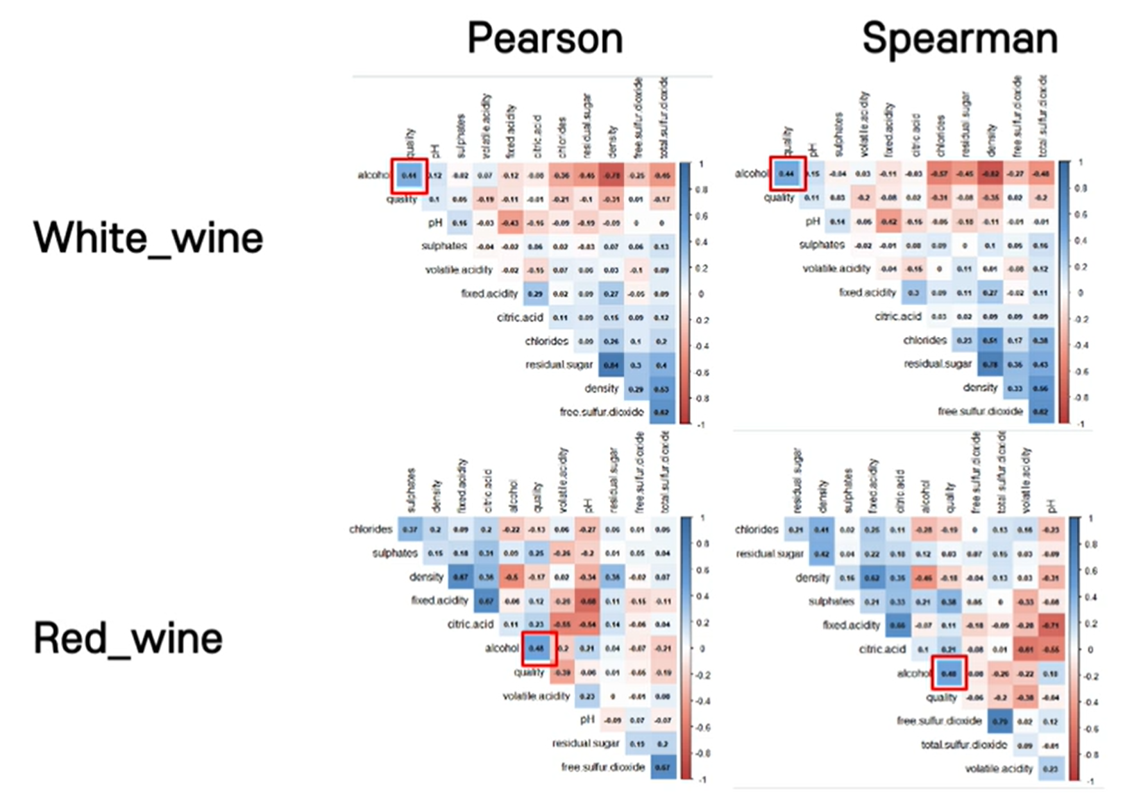
#잘 안보인다.
pairs(red_wine)
pairs(white_wine)

library(ggplot2)

#alcohol값과 quality의 값이 양의 관계에 있다는 것이 직관적으로 보인다.
ggplot(red_wine, aes(y=alcohol)) +
  geom_boxplot(aes(col=factor(quality)))
ggplot(white_wine, aes(y=alcohol)) +
  geom_boxplot(aes(col=factor(quality)))
shapiro.test(red_wine$alcohol) # p-value: 2.2/10^16. 귀무가설 기각. 정규분포를 따르지 않는다.
shapiro.test(white_wine$alcohol) # p-value: 2.2/10^16. 귀무가설 기각. 정규분포를 따르지 않는다.

ggplot(red_wine) +
  geom_histogram(aes(x=alcohol, fill=factor(quality)))
→ 저품질 와인(3~6)들의 분포가 낮은 알코올 도수에 지나치게 치우쳐 있음
library(dplyr)

high_quality_white <- white_wine %>% filter(quality > 6)
shapiro.test(high_quality_white$alcohol) #p-value: 5.908/10^14. 귀무가설 기각

high_quality_red <- red_wine %>% filter(quality > 6)
shapiro.test(high_quality_red$alcohol) #p-value:0.2322. 유의확률 0.05에 대하여 귀무가설 채택

red_wine %>% filter(quality > 6) %>% ggplot() +
  geom_density(aes(x=alcohol), col='red') + #전체 레드와인 알코올 분포
  geom_density(data=red_wine, aes(x=alcohol)) #고품질 레드와인 알코올 분포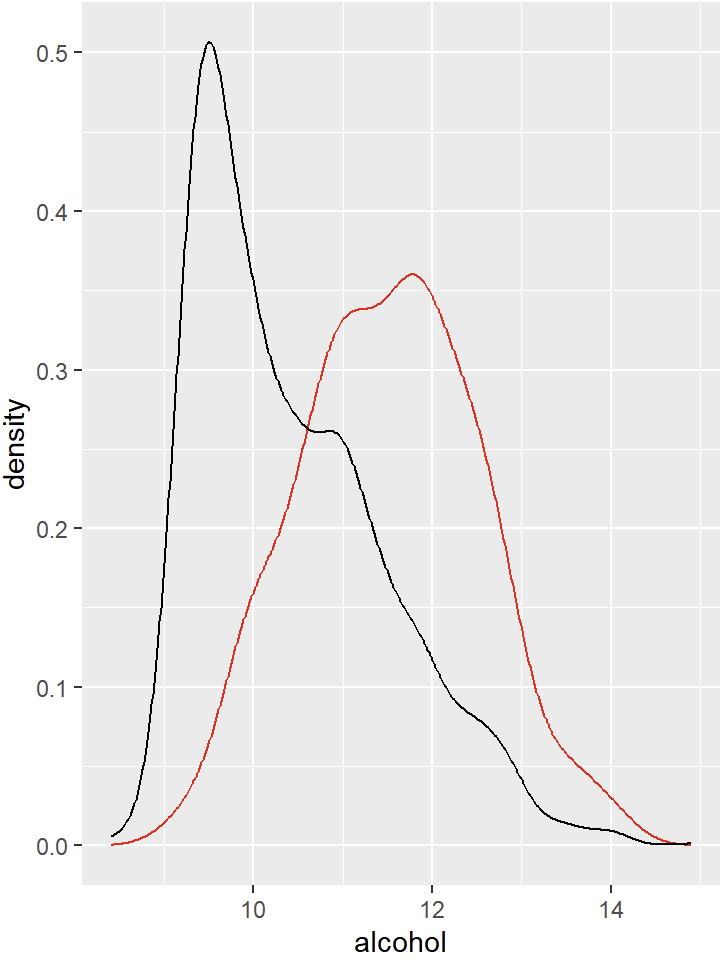
→ 고품질 레드와인은 정규분포를 띄고있다.
# 모집단의 표준편차값을 알 수 없기에 t검정 사용
t.test(x=high_quality_red$alcohol, alternative = "two.sided", mu=11.5, conf.level = 0.95)
- p-value가 유의수준 0.05보다 크므로 귀무가설 채택
- 즉, 고품질 레드 와인의 평균 알코올 도수는 11.5%이다 라는 가설은 타당하다.
👥 파트너간 상보적 학습 및 강의 내용 리뷰
파이차트 실습을 하던 도중 pie(freight, label=label_data) 이 코드를 실행하니 원이 엄청 작게 출력되었다. 이전 예시에서 radius를 1로 설정하니 차트가 잘 나왔었던 기억이나서 1로 설정하니 모양이 잘 표현되었다. 교재에는 radius가 원의 크기 조절이라고만 나와있어서 1이라는 값이 백분율인지 cm인지 궁금해서 찾아보니 반지름의 크기인것을 알 수 있었다.
처음에 작게 나왔던 이유는 RStudio를 팝업창으로 작게 띄워놔서 그 크기에 비례하게 그래프가 그려진 것 같다.
🙋♀️ 멘토링 시간
개념을 간단히 정리한 후, 다양한 코드들을 강사님과 함께 풀어보는 시간을 가졌다.
rm(list=ls())
library('dplyr')
library('ggplot2')

####################################
# dplyr을 이용하여 데이터 다루기
####################################
data <- airquality
str(data)
head(data)

# Month별 데이터 수 추출
data %>% select(Month) %>% table()

# 7월 31일 데이터 추출
data %>% filter(Month==7 & Day==31)

# 7월 31일 Ozone, Solar.R
data %>% filter(Month==7 & Day==31) %>% select('Ozone', 'Solar.R')

# 7월 모든 데이터를 추출하여 data7에 저장
data7 <- data %>% filter(Month==7)
head(data7)

##########################
# ggplot
##########################
# data7의 Temp의 변화를 line그래프로 표현
ggplot(data7, aes(x=Day, y=Temp)) +
  geom_line()

# 월별 Temp의 변화를 서브그래프로 각각 표현(3행 2열)
ggplot(data, aes(x=Day, y=Temp)) +
  geom_line() +
  facet_wrap(~Month, nrow=3, ncol=2) +
  stat_smooth(level=0.95) + # 회귀선 추가(신뢰구간:0.95)
  ggtitle('월별기온') # 제목 작성 ('월별 기온')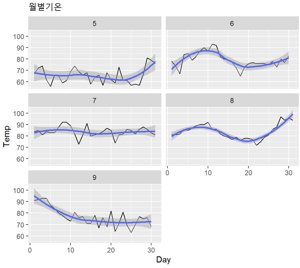
✍️ 마무리하며
여러가지 코드를 실행해보며 다양한 예측 결과를 보는 과정이 재미있었다. 특히 ggplot을 활용하여 그래프를 꾸며가는 과정이 신기했다. 앞으로 R과 Python을 적재적소에 잘 활용하여 데이터 분석을 하고싶다.
* 유데미 큐레이션 바로가기 : https://bit.ly/3HRWeVL
* STARTERS 취업 부트캠프 공식 블로그 : https://blog.naver.com/udemy-wjtb
📌 본 후기는 유데미-웅진씽크빅 취업 부트캠프 4기 데이터분석/시각화 학습 일지 리뷰로 작성되었습니다.
'교육 > 유데미 스타터스 4기' 카테고리의 다른 글
| [👩💻TIL 15일차 ] 유데미 스타터스 취업 부트캠프 4기 (1) | 2023.02.24 |
|---|---|
| [👩💻TIL 14일차 ] 유데미 스타터스 취업 부트캠프 4기 (0) | 2023.02.23 |
| [👩💻TIL 12일차 ] 유데미 스타터스 취업 부트캠프 4기 (0) | 2023.02.22 |
| [👩💻TIL 11일차 ] 유데미 스타터스 취업 부트캠프 4기 (0) | 2023.02.20 |
| 유데미 스타터스 취업 부트캠프 4기 - 데이터분석/시각화(태블로) 2주차 학습 일지 (1) | 2023.02.17 |


